The following interview is authorized under the Creative Commons Attribution ShareAlike License.
For the original text, please go to: "Inspire" on Dirty-Mag.com
For the original text, please go to: "Inspire" on Dirty-Mag.com
PAULA SCHER: DESIGNING THE WORLD WE KNOW
DIRTY HAD THE PLEASURE OF TALKING WITH DESIGN INDUSTRY LEGEND, PAULA SCHER, WHO IS RESPONSIBLE FOR CREATING THE IDENTITY OF SOME OF THE WORLD’S MOST SUCCESSFUL BRANDS, TIME AND AGAIN. A COINCIDENCE? OR JUST CLEVER DESIGN?WE COULDN’T PASS UP THE OPPORTUNITY TO ASK THE INSPIRATIONAL ART DIRECTOR A MULTITUDE OF QUESTIONS, FROM WHO INSPIRES HER, TO WHAT HER FAVORITE FONT IS.
TEXT Paul Bruno, Andrew Persoff & Anthony Spinello
DIRTY: WHEN YOU WERE A YOUNG GIRL, WHAT DID YOU ENVISION YOURSELF DOING FOR A LIVING AS AN ADULT? DID YOU ALWAYS KNOW THAT YOU WANTED TO BE AN ARTIST / DESIGNER?
PAULA SCHER: I wanted to be a singer, dancer, piano-player and bare back rider. When I got to be older and realized I wasn’t a beauty, I decided I wanted to be an artist. I didn’t know what a designer was.
D: WHAT WAS ONE OF THE VERY FIRST INSPIRATIONAL ARTWORKS OR DESIGNS YOU REMEMBER SEEING THAT LEFT A LASTING IMPRESSION?
PS: I remember seeing the cover for the Broadway show album of South Pacific. Mary Martin and Ezio Pinza’s head shots were stripped into the shape of an anchor. I didn’t recognized it as an anchor and wondered why their heads had a funny shape. I remember it vividly to this day. I think it was designed by Alex Steinweiss.
D: HOW DID YOU GET TO DESIGNING ALBUM COVERS FOR CBS & ATLANTIC IN THE 70s? WHAT WAS THE FIRST ALBUM COVER YOU DESIGNED?
PS: I worked at CBS Records designing small space ads for the Columbia and Epic labels. The Art Director of Atlantic Records saw them and offered me a job at Atlantic. I took the job because I would get to design record covers as well as ads. The first cover I designed was a John Coltrane album called Alternate Takes. I put type over a David Stone Martin illustration. I was told I had to use the illustration because it came from Coltrane’s management. I hated the illustration. I worked at Atlantic for one year and was then hired back to CBS Records to be East Coast Art Director of album covers.
D: HOW DID YOU GET INTO EDITORIAL DESIGN? WHAT NOTABLE PHOTOGRAPHERS HAVE YOU WORKED WITH?
PS: When I left CBS Records, where I worked for 10 years, I designed hundreds of album covers but I had no experience designing magazines. Time Inc. hired me to design a prototype for a new magazine they were trying to launch called Quality. They also had 4 or 5 other designers working on prototypes and I was the “out of the box” choice, because I had no magazine experience. Time Inc. retained me to design another magazine prototype, but they never launched either publication. After that I had “magazine experience”. I never worked with famous photographers designing magazines. The budgets were always too low. However, I worked with Avedon, Scavullo and Irving Penn when I art directed album covers.
D: YOU HAVE CREATED SOME OF THE MOST ICONIC BRAND IDENTITIES OF THE PAST COUPLE OF DECADES. WHAT WOULD YOU SAY HAS BEEN THE MOST ENGAGING PROJECT YOU’VE WORKED ON?
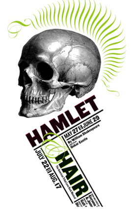
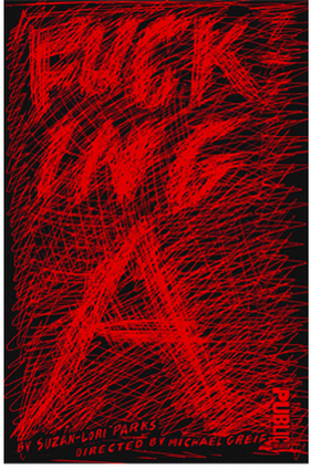
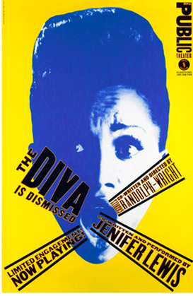
PS: The Public Theater.
D: YOU HAVE SAID THAT YOUR “MOST RADICAL WORK FOR A CULTURAL INSTITUTION WAS FOR THE PUBLIC THEATER.” HOW WERE YOU ABLE TO CONVINCE THE INSTITUTION TO MAKE SUCH A RADICAL CHANGE?
PS: The Theater Director, George Wolfe, wanted to take a chance and do something that was truly recognizable.
D: AT A TIME WHEN COMMUNICATIONS IS DRIVEN BY THE DIGITAL REALM, HOW IMPORTANT IS THE IMPLEMENTATION OF THE “HUMAN TOUCH OF THE HAND”?
PS: I really think you mean “the brain”. Things that look like they were purely generated by a computer are soulless. The computer isn’t the enemy, it’s neutral. A human point of view gives it soul.
D: HOW IMPORTANT IS “PLAY” IN DESIGN?
PS: Design that wasn’t play to begin with generally feels stiff and boring.
D: AT THE TIME WHEN THE CITI LOGO WAS REALIZED ON A NAPKIN IN 1998, YOU HAVE BEEN QUOTED, “IT’S A SECOND DONE IN 34 YEARS”. HOW MANY MORE “SECONDS” HAVE YOU HAD IN YOUR YEARS THERE AFTER, FOR EITHER CITIBANK OR OTHER CLIENTS?
PS: Most of my best ideas are my first ones, because they are the most instinctive. They require a lot of refinement, but when you look at my first sketches you see it.
TEXT Paul Bruno, Andrew Persoff & Anthony Spinello
DIRTY: WHEN YOU WERE A YOUNG GIRL, WHAT DID YOU ENVISION YOURSELF DOING FOR A LIVING AS AN ADULT? DID YOU ALWAYS KNOW THAT YOU WANTED TO BE AN ARTIST / DESIGNER?
PAULA SCHER: I wanted to be a singer, dancer, piano-player and bare back rider. When I got to be older and realized I wasn’t a beauty, I decided I wanted to be an artist. I didn’t know what a designer was.
D: WHAT WAS ONE OF THE VERY FIRST INSPIRATIONAL ARTWORKS OR DESIGNS YOU REMEMBER SEEING THAT LEFT A LASTING IMPRESSION?
PS: I remember seeing the cover for the Broadway show album of South Pacific. Mary Martin and Ezio Pinza’s head shots were stripped into the shape of an anchor. I didn’t recognized it as an anchor and wondered why their heads had a funny shape. I remember it vividly to this day. I think it was designed by Alex Steinweiss.
D: HOW DID YOU GET TO DESIGNING ALBUM COVERS FOR CBS & ATLANTIC IN THE 70s? WHAT WAS THE FIRST ALBUM COVER YOU DESIGNED?
PS: I worked at CBS Records designing small space ads for the Columbia and Epic labels. The Art Director of Atlantic Records saw them and offered me a job at Atlantic. I took the job because I would get to design record covers as well as ads. The first cover I designed was a John Coltrane album called Alternate Takes. I put type over a David Stone Martin illustration. I was told I had to use the illustration because it came from Coltrane’s management. I hated the illustration. I worked at Atlantic for one year and was then hired back to CBS Records to be East Coast Art Director of album covers.
D: HOW DID YOU GET INTO EDITORIAL DESIGN? WHAT NOTABLE PHOTOGRAPHERS HAVE YOU WORKED WITH?
PS: When I left CBS Records, where I worked for 10 years, I designed hundreds of album covers but I had no experience designing magazines. Time Inc. hired me to design a prototype for a new magazine they were trying to launch called Quality. They also had 4 or 5 other designers working on prototypes and I was the “out of the box” choice, because I had no magazine experience. Time Inc. retained me to design another magazine prototype, but they never launched either publication. After that I had “magazine experience”. I never worked with famous photographers designing magazines. The budgets were always too low. However, I worked with Avedon, Scavullo and Irving Penn when I art directed album covers.
D: YOU HAVE CREATED SOME OF THE MOST ICONIC BRAND IDENTITIES OF THE PAST COUPLE OF DECADES. WHAT WOULD YOU SAY HAS BEEN THE MOST ENGAGING PROJECT YOU’VE WORKED ON?
PS: The Public Theater.
D: YOU HAVE SAID THAT YOUR “MOST RADICAL WORK FOR A CULTURAL INSTITUTION WAS FOR THE PUBLIC THEATER.” HOW WERE YOU ABLE TO CONVINCE THE INSTITUTION TO MAKE SUCH A RADICAL CHANGE?
PS: The Theater Director, George Wolfe, wanted to take a chance and do something that was truly recognizable.
D: AT A TIME WHEN COMMUNICATIONS IS DRIVEN BY THE DIGITAL REALM, HOW IMPORTANT IS THE IMPLEMENTATION OF THE “HUMAN TOUCH OF THE HAND”?
PS: I really think you mean “the brain”. Things that look like they were purely generated by a computer are soulless. The computer isn’t the enemy, it’s neutral. A human point of view gives it soul.
D: HOW IMPORTANT IS “PLAY” IN DESIGN?
PS: Design that wasn’t play to begin with generally feels stiff and boring.
D: AT THE TIME WHEN THE CITI LOGO WAS REALIZED ON A NAPKIN IN 1998, YOU HAVE BEEN QUOTED, “IT’S A SECOND DONE IN 34 YEARS”. HOW MANY MORE “SECONDS” HAVE YOU HAD IN YOUR YEARS THERE AFTER, FOR EITHER CITIBANK OR OTHER CLIENTS?
PS: Most of my best ideas are my first ones, because they are the most instinctive. They require a lot of refinement, but when you look at my first sketches you see it.
|
|
|
D: MANY YOUNG DESIGNERS ARE IN SEARCH OF IMMEDIATE “RADICAL” WORK AND THEN REALIZE THAT THOSE JOBS ARE FEW AND FAR BETWEEN. EARLY ON IN YOUR CAREER, HOW DID YOU NAVIGATE YOUR OWN DESIRE FOR CHANGE? HAVE YOU EVER BURNED ANY BRIDGES?
PS: I have had fights with clients. I am better about not burning bridges now, though I often feel the same frustrations I felt 30 years ago.
D: WAS THERE A DESIGNER, MENTOR OR TEACHER THAT TAUGHT YOU SOMETHING EARLY ON IN YOUR CAREER THAT CONTINUES TO RESONATE WITH YOU TODAY? IF SO, WHO AND WHAT?
PS: I had difficulty working with typography and didn’t relate to it. My teacher at Tyler School of Art, Stanislas Zagorski told me to illustrate with type. That’s when I began to notice that type had character.
D: YOU OFTEN REFER TO RUSSEL BAKER’S THOUGHTS ON “SERIOUS” VS “SOLEMN”. WHICH OF THE TWO ARE YOU?
PS: I am both. Interviews are solemn. Design is serious.
D: YOU’RE CURRENTLY AN INSTRUCTOR AT DIRTY’S ALMA MATER, SCHOOL OF VISUAL ARTS. CONSIDERING HOW BUSY YOU ARE IN YOUR PROFESSIONAL CAREER AND THE NUMBER OF DESIGN INSTITUTIONS IN NYC, WHY IS IT IMPORTANT FOR YOU TO TEACH (AND WHY DID YOU CHOOSE TO WORK) FOR SVA?
PS: Teaching helps me see. If I have to explain to a student how to make their work better I have to see what they see first, and then figure out how they can improve it. I get more out of it than they do and often I hire my students.
I have taught at SVA for 30 years because they never interfere with how I teach my class.
D: IS THERE A DIFFERENCE BETWEEN YOUR REPRESENTATION AS AN ARTIST AT A GALLERY VERSUS A DESIGNER AT A FIRM?
PS: Yes, it’s a structural and economic difference. Design has a purpose. Design is commissioned and there are participants in the design process who have an important say. Art has no purpose and usually no participants.
A designer negotiates a fee for a design with his client. An artist has the prices set by the gallery. A designer generally gets paid for their work. An artist only gets paid if someone buys the work.
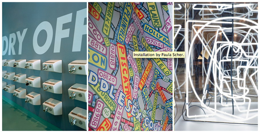
D: YOU DESIGNED THE IDENTITY FOR FRIENDS OF THE HIGH LINE IN 2001. EIGHT YEARS LATER, THE LOGO THAT REPORTEDLY TOOK YOU AN HOUR HAS BECOME A SYMBOL FOR THE PARK ITSELF. HOW INFLUENTIAL DO YOU THINK DESIGN AND COMMUNICATION, IN ALL ASPECTS, PLAYED IN THE SUCCESS OF THE PARK’S ESTABLISHMENT?
PS: Robert Hammond, who founded the Highline, would tell you that once the Friends of the Highline Organization had a “real logo” they looked like a serious fund-raising organization and the community, government, and wealthy donors all took them more seriously. When you start something, you need a logo.
PS: I have had fights with clients. I am better about not burning bridges now, though I often feel the same frustrations I felt 30 years ago.
D: WAS THERE A DESIGNER, MENTOR OR TEACHER THAT TAUGHT YOU SOMETHING EARLY ON IN YOUR CAREER THAT CONTINUES TO RESONATE WITH YOU TODAY? IF SO, WHO AND WHAT?
PS: I had difficulty working with typography and didn’t relate to it. My teacher at Tyler School of Art, Stanislas Zagorski told me to illustrate with type. That’s when I began to notice that type had character.
D: YOU OFTEN REFER TO RUSSEL BAKER’S THOUGHTS ON “SERIOUS” VS “SOLEMN”. WHICH OF THE TWO ARE YOU?
PS: I am both. Interviews are solemn. Design is serious.
D: YOU’RE CURRENTLY AN INSTRUCTOR AT DIRTY’S ALMA MATER, SCHOOL OF VISUAL ARTS. CONSIDERING HOW BUSY YOU ARE IN YOUR PROFESSIONAL CAREER AND THE NUMBER OF DESIGN INSTITUTIONS IN NYC, WHY IS IT IMPORTANT FOR YOU TO TEACH (AND WHY DID YOU CHOOSE TO WORK) FOR SVA?
PS: Teaching helps me see. If I have to explain to a student how to make their work better I have to see what they see first, and then figure out how they can improve it. I get more out of it than they do and often I hire my students.
I have taught at SVA for 30 years because they never interfere with how I teach my class.
D: IS THERE A DIFFERENCE BETWEEN YOUR REPRESENTATION AS AN ARTIST AT A GALLERY VERSUS A DESIGNER AT A FIRM?
PS: Yes, it’s a structural and economic difference. Design has a purpose. Design is commissioned and there are participants in the design process who have an important say. Art has no purpose and usually no participants.
A designer negotiates a fee for a design with his client. An artist has the prices set by the gallery. A designer generally gets paid for their work. An artist only gets paid if someone buys the work.
D: YOU DESIGNED THE IDENTITY FOR FRIENDS OF THE HIGH LINE IN 2001. EIGHT YEARS LATER, THE LOGO THAT REPORTEDLY TOOK YOU AN HOUR HAS BECOME A SYMBOL FOR THE PARK ITSELF. HOW INFLUENTIAL DO YOU THINK DESIGN AND COMMUNICATION, IN ALL ASPECTS, PLAYED IN THE SUCCESS OF THE PARK’S ESTABLISHMENT?
PS: Robert Hammond, who founded the Highline, would tell you that once the Friends of the Highline Organization had a “real logo” they looked like a serious fund-raising organization and the community, government, and wealthy donors all took them more seriously. When you start something, you need a logo.
D: TODAY, THE HIGH LINE IS A RESPECTED, SOUGHT-AFTER DESIGN STATEMENT LOCALLY AND BEYOND. SINCE THE OPENING OF THE HIGH LINE, HAVE YOU NOTICED ANY DIFFERENCE IN THE WAY MAJOR AMERICAN CITIES EMBRACE GOOD DESIGN FOR PUBLIC USE?
PS: I think some cities have become design conscious, architecturally aware, environmentally sensitive, and other cities have not.
D: DO YOU CONSIDER THE HIGH LINE DESIGN “RADICAL” OR “SOLEMN”?
PS: Neither. I think the logo is a perfect symbol for the Highline, but not especially a graphic breakthrough.
D: WHAT DESIGNERS / CREATIVE DIRECTORS INSPIRE YOU?
PS: All of my Pentagram partners inspire me and of course, my husband Seymour Chwast. I am president of an international organization of designers called AGI and everyone in it is inspiring. Go to their website and see.
D: FAVORITE FONT OF ALL TIME?
PS: No favorite. My default font is Aksidenz Grotesk, or things that look like it which is essentially Helvetica with some character.
D: WHAT ARE YOU WORKING ON AT THE MOMENT?
PS: A lot of environmental projects, and some industry pro-bono work and something I can’t talk about…
D: WHAT DOES DIRTY MEAN TO YOU?
PS: My apartment, right at this minute. We are renovating.
