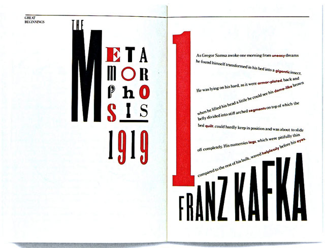
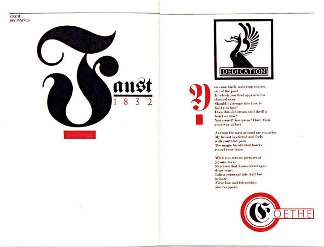
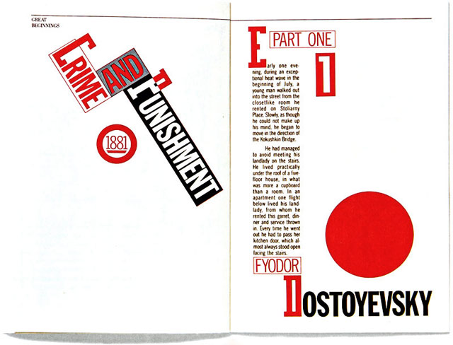
Great Beginnings, 1984
A promotional book for their new design firm that featured the 1st two paragraphs of famous novels designed in the period style in which they had been written. Successful in gaining new clients for their firm, it didn't represent their actual style.
|
|
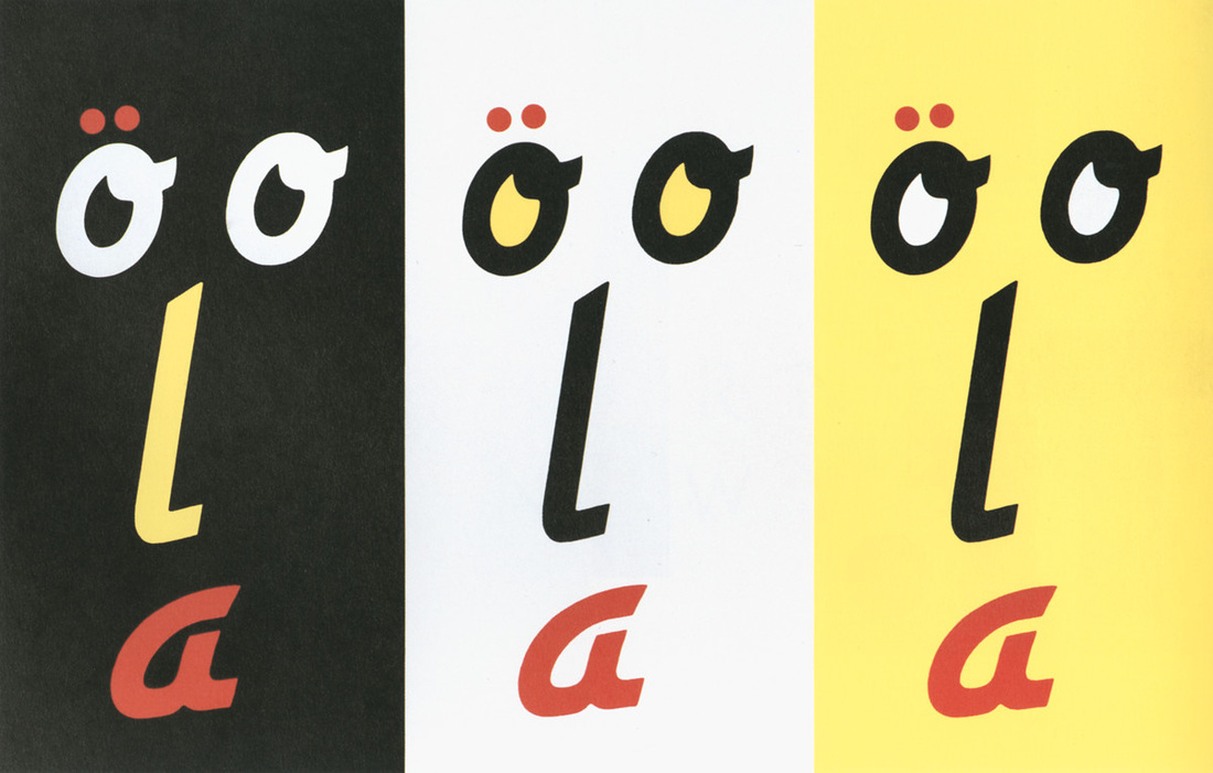
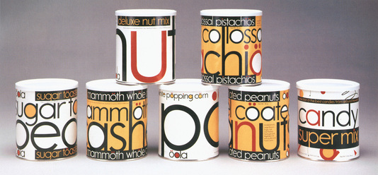
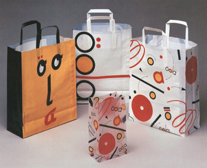
Oola Candy Store, 1986
Swedish entrepeneurs approached Scher about designing an identity and some packaging for a chain of candy stores that were planning to open in shopping malls on the East Coast. They already owned stored in Sweden and the UK. Their main attraction were large glass cylinders filled with brightly colored candy. They didn't make the candy, but were selling an environment and an experience. Paula didn't think of it as branding, but designing an entertaining environment. Originally called Sweetwave, but Scher came up with OOLA. She choose the color palette and designated interior and exterior signage.
|
|
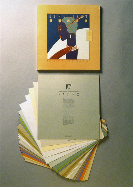
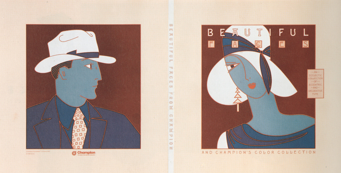
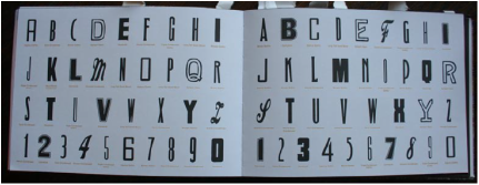
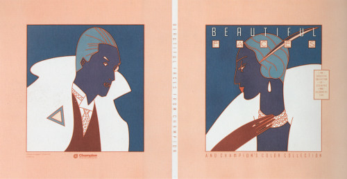
Beautiful Faces/Dingbate, 1986
Promotion for Champion Papers for their Carnival paper line. Wanted to create some kind of tool that was useful for designers. Collected Victorian, art nouveau, art deco, streamline, etc. typefaces. Scher selected 20 odd fonts and laid their alphabets out on a grid on a 11x17 inch photocopier. These typefaces were then printed on Champion Carnival papers, inserted into a portfolio and distributed to 40,000 graphic designers. It became the most requested promotional piece in Champion's history. It gave the design community access to a reproducible type portfolio for free and had the greatest individual impact Scher would make on the design style of the times.
|
|
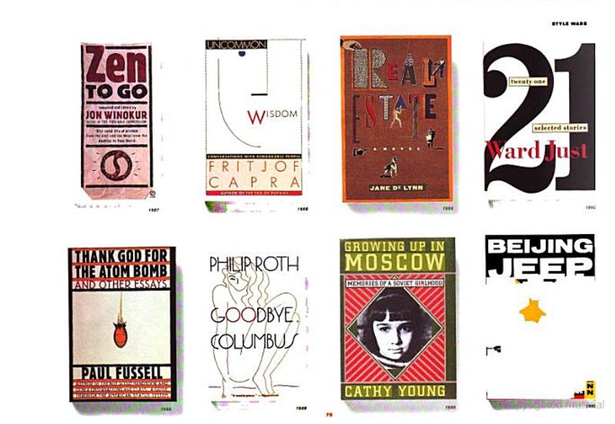
Various book covers